Vintage Books: A Fairy Tale Revolution

I was thrilled to be commissioned by Vintage Books to illustrate 3 fairy tales that have been given a feminist spin by 3 bestselling authors; Malorie Blackman, Kamila Shamsie and Jeanette Winterson. The tales were Blueblood, Duckling and Hansel and Greta- all modern takes on classic tales.

A photo of the book covers for the Fairy Tale Revolution series, Blueblood, Duckling and Hansel and Greta

I created the interior illustrations for the series to go alongside another title by Rebecca Solnit- Cinderella Liberator, which used original illustrations by Arthur Rackham- one of my illustration heroes. It was a real honour to illustrate stories by such well respected authors that I’ve long admired.

A fairy tale book illustration from Duckling by Kamila Shamsie of a duck sitting in her nest with her baby ducklings hatching around her
2 fairy tale book illustrations from Duckling by Kamila Shamsie of ducklings and the ugly duckling swimming in the water. A farmyard artwork scene with the duckling flying over fields with a barn and tree in silhouette by moonlight
A book illustration from Blueblood of a woman's portrait in silhouette inside a decorative frame border
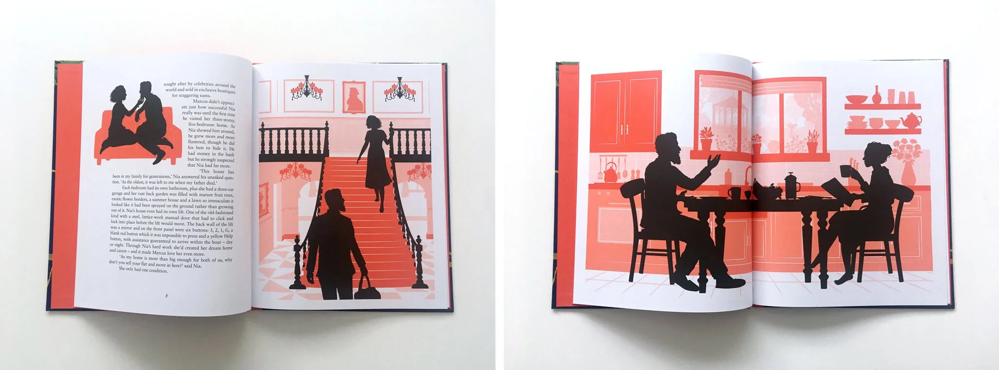
Two book illustrations from Blueblood of a couple in several scenes. On the sofa, climbing up a set of stairs and in the kitchen
A fairy tale book illustration from Hansel and Greta of a cabin in the forest with portraits of Hansel, the woodcutter and the aunt
A fairy tale book illustration from Hansel and Greta of a cabin in the forest with portraits of Hansel, Great and the woodcutter planting seeds in the forest through the changing seasons.

Working with book designer Friederike Huber, there was a lot of freedom to work out which parts of the text to illustrate. After reading through the tales several times, along with their original counterpart tales, I noted what I thought were the key scenes and very loosely created sketches for them. Then Friederike created the layouts and, with the team at Vintage, decided which illustrations would fit best. For Duckling, I took a walk around the local lakes in my area for inspiration on the setting, and looked over old photos from trips to forests in the UK and Germany for Hansel and Greta. For Blueblood I looked at a lot of fashion and interior design magazines.

A book illustration from Blueblood of a man and a woman in a library or office. He is nervous. There are books, a desk, a lamp and tools in silhouette

I worked with a wonderful team at Vintage- senior designers Julia Connolly and Kris Potter, editor Charlotte Knight plus Friederike. It was one of those special projects where the working relationship was particularly creative and productive, with lots of ideas being bounced back and forth. The book covers were designed and illustrated by cover designer Anna Morrison- I was tasked with creating silhouette characters to be dropped into her beautiful designs.

The series is published today and available to buy from WaterstonesAmazon and all good bookshops.

The Little Mermaid Creative Process

As we continue to be under lockdown due to the Coronavirus crisis, we might not be able to visit any bookshops in person but the paperback edition of The Little Mermaid was published just last week, so I thought I’d share some behind the scenes sneak peeks of my illustration process.

The Little Mermaid is rewritten by the wonderful Geraldine McCaughrean, based on the original tale by Hans Christian Andersen and published by Orchard Books. With design by the fantastic Sarah Malley.

The Cover

Book cover and back cover for The Little Mermaid Picture Book. A Mermaid illustration swimming in amongst a coraf reef and an underwater palace with fish and a seahorse.

The very first thing I set about doing was deciding what our protagonist, the Little Mermaid would actually look like. I was excited to be able to draw lots of swirling hair and to create lots of fish scale details for her tail- one of my favourite things is adding lots and lots of detailing. I also started to create her underwater sea palace and coral reef setting.

I tend to sketch some things in pencil and then move on to drawing digitally in Adobe Illustrator using a Wacom tablet. I draw a very rough shape before working back in to this to add more detail. I’ll draw all of the elements; characters and background scenery and then start playing around with layering them, figuring out what works best.

Rough illustration of a mermaid and a palace under the sea
The Little Mermaid Picture Book rough sketches of an underwater palace or castle and coral plants

Once I was happy with her general look, I redrew her to fit the cover better, and started to try to frame the title with seaweed. I sketched out a basic seaweed shape, drew this digitally and then thickened the seaweed up, trying to make it look more organic. I then filled the rest of the cover with decorative coral, shells and bubbles.

Rough version of a book cover for The Little Mermaid. A mermaid illustration swimming with fish and a seahorse.

Cover work inprogress

Work in progress sketches and images of The Little Mermaid book cover coming together

Cover sketch, more work in progress and final cover

Inside the book

Here are a few initial sketches and progress images from the interior illustrations, all the way up to final artwork.

Rough sketches and development artwork for The Little Mermaid

Sketch and work in progress

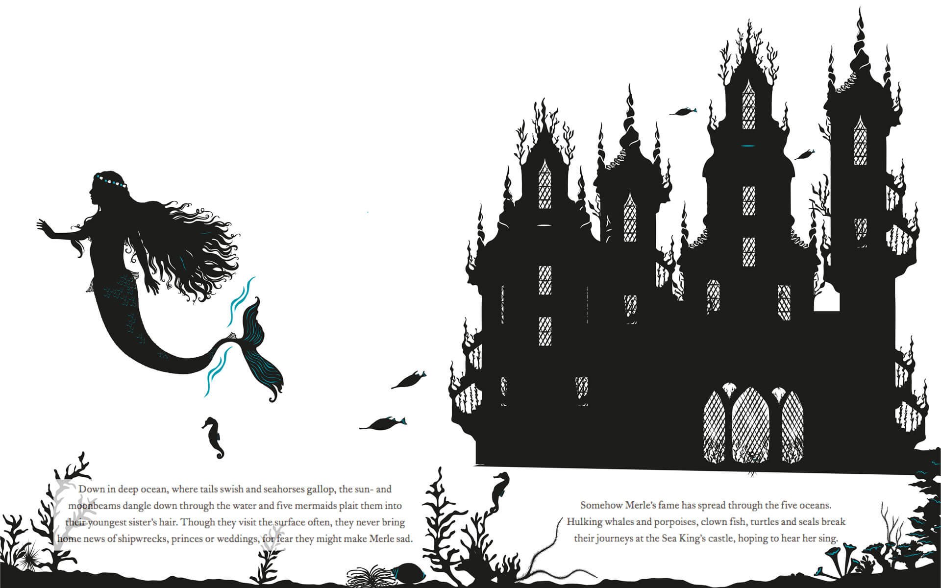
Picture book spread of mermaids swimming in front of a castle under the sea

Final illustration

Sketches from the Little Mermaid picture book. Fireworks on a ship and a mermaid looks on

Sketch and work in progress

Picture book spread of the Little Mermaid and the prince and his ship with fireworks in the sky

Final illustration

Sketches of stormy waters

Sketch and work in progress

Picture book spread of a ship caught in a storm with waves rolling and boat sinking

Final illustration

Thanks for reading! You can see more of my books and other work at https://www.laurabarrett.co.uk/books.